Wreszcie, Strony, Które Po Prostu *Działają* na Urządzeniach Mobilnych
- Koniec z Zmniejszaniem i Powiększaniem
Przeglądaj nasze szablony i zobacz, jak dobrze Twoja strona *może* wyglądać na każdym urządzeniu. To łatwiejsze, niż myślisz.
Znajdź piękny, gotowy do urządzeń mobilnych punkt wyjścia

文件内容展示网页
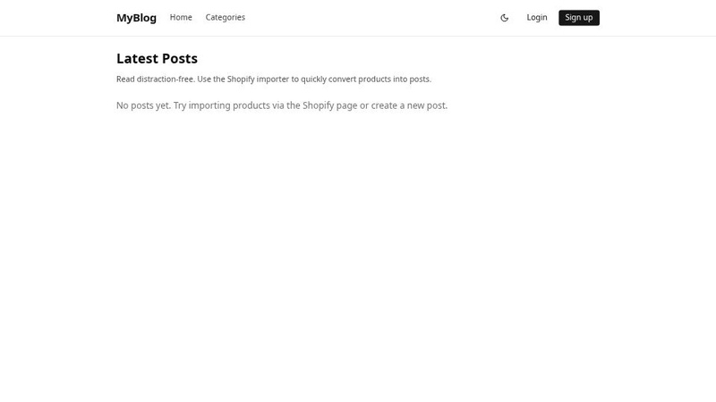
ブログパーソナル
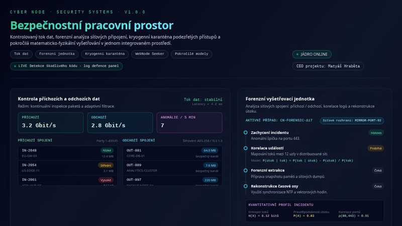
Forenzní kybernetická ochrana

网椅工坊
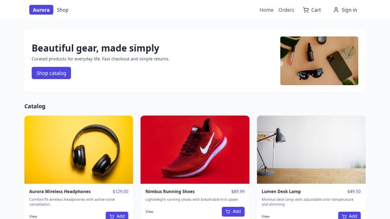
E-Com Master
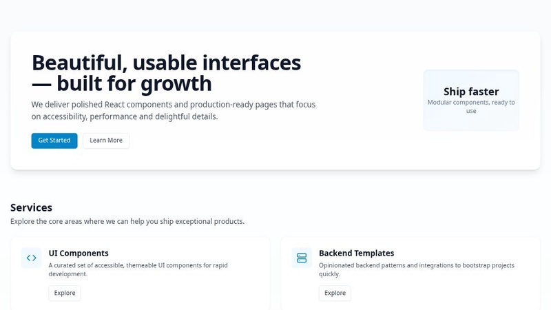
CasaServiços
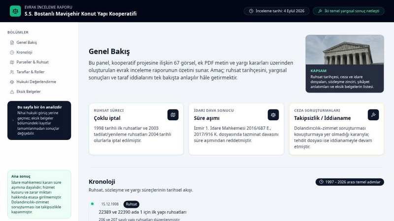
WebProPlus
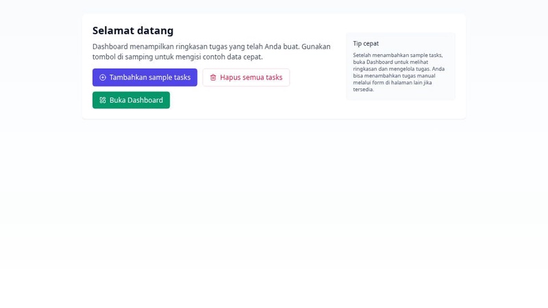
Daily Program Planner
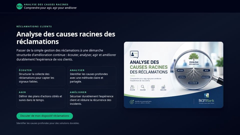
SiteWebImage

激光雕刻机市场论断验证报告
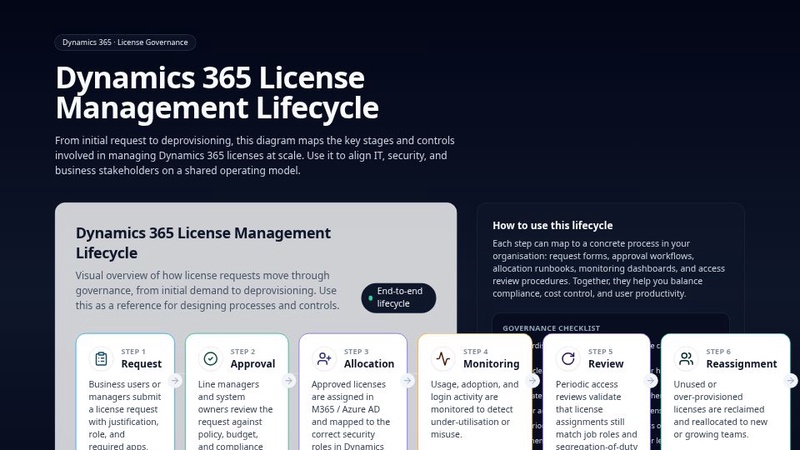
Dynamics 365 Licence Management Lifecycle
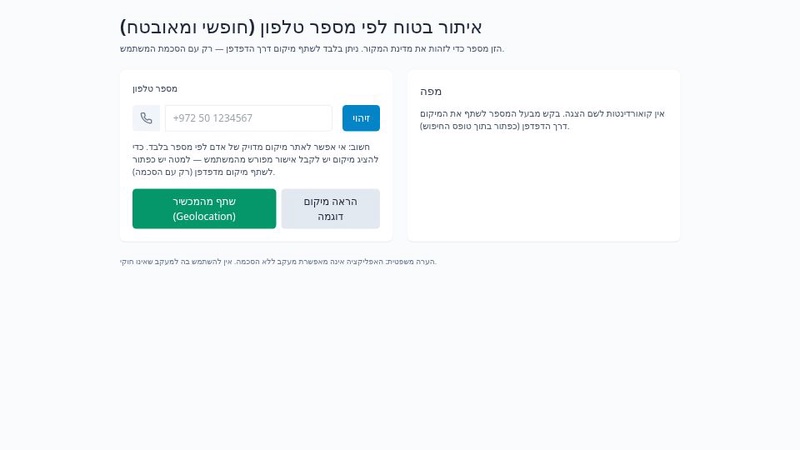
מעקב טלפון וחיפוש מיקום חינמי
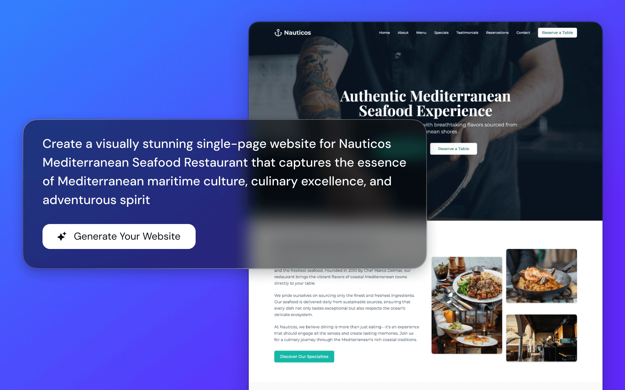
Stworzone dla Każdego Ekranu
Zastanawiam się, czy moja strona wygląda dobrze na telefonie? To ciągły niepokój. Nasze szablony są zaprojektowane z myślą o 'mobilności na pierwszym miejscu', więc są idealne na małym ekranie, a następnie pięknie dostosowują się do tabletów i komputerów stacjonarnych.
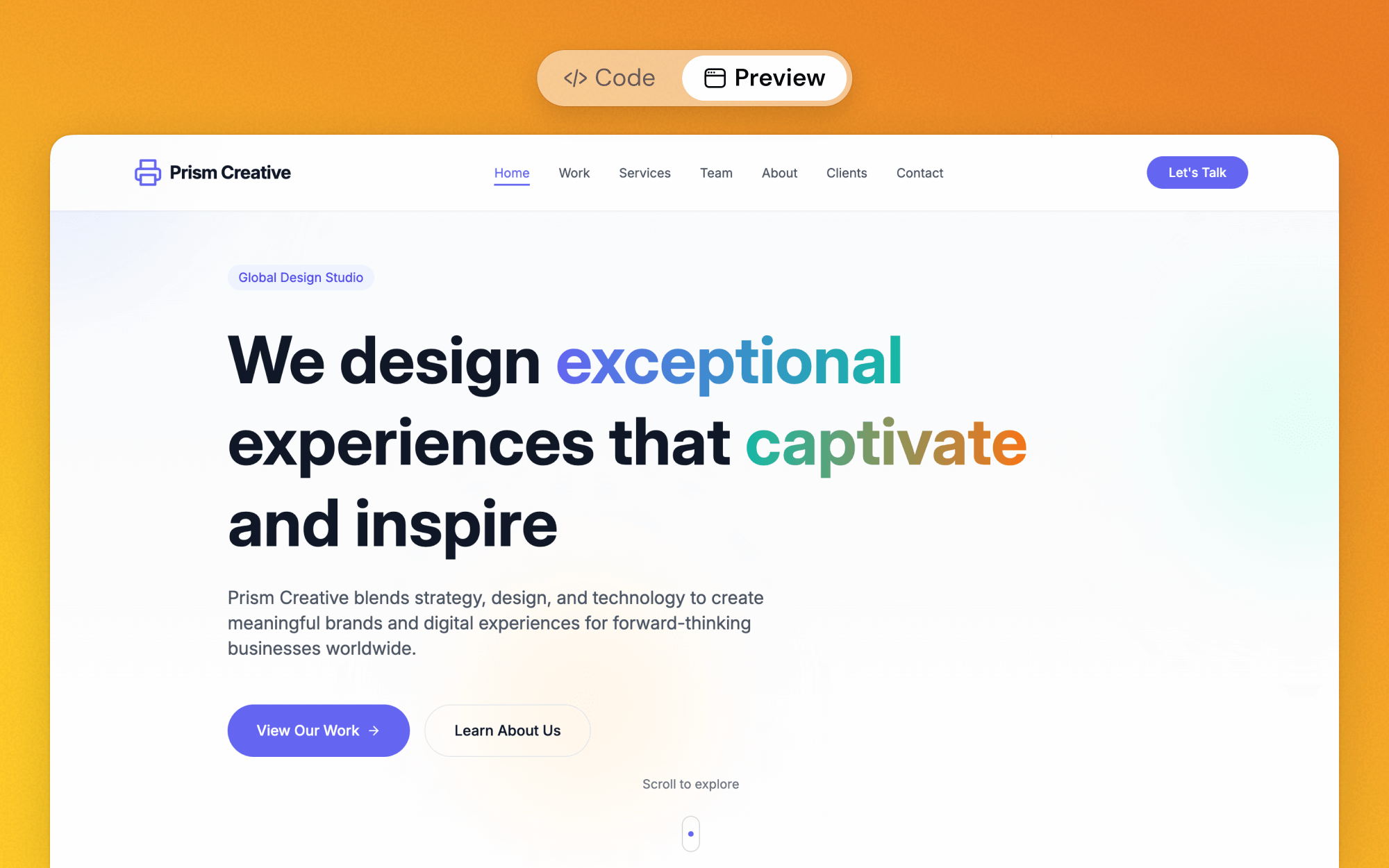
Zobacz To Sam
Ciekawy, jak to będzie wyglądać? Możesz podglądać każdy szablon bezpośrednio na swoim telefonie, zanim jeszcze zaczniesz. Zero niespodzianek, tylko ulga.
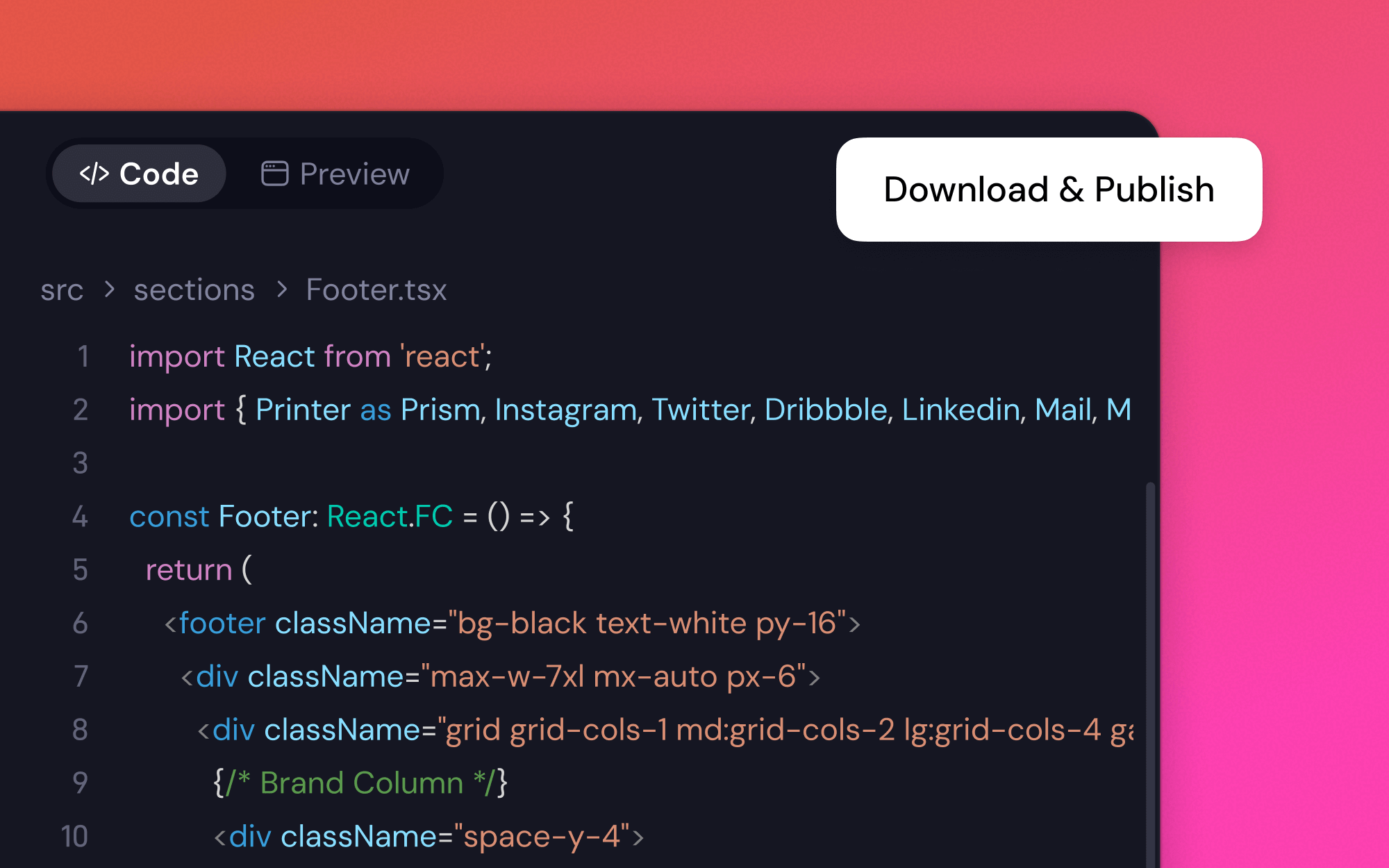
Gotowe na Rzeczywisty Świat
To nie tylko ładne obrazki. Są zbudowane na czystym, nowoczesnym kodzie. To oznacza, że są szybkie, niezawodne i gotowe do uruchomienia, kiedy tylko Ty chcesz.
Znajdowanie Idealnego Szablonu Mobilnego w 3 Krokach
1
Odkryj Swoje Opcje
Powiedz nam trochę o swoim projekcie — może 'prosty blog' lub 'galeria moich zdjęć'. Zaproponujemy kilka punktów wyjścia, które mogą Ci odpowiadać.
2
Zrób To Po Swojemu
Znalazłeś szablon, który Ci się podoba? Świetnie. Teraz możesz zmienić kolory, zamienić obrazy i przepisać tekst. To Twoja przestrzeń do eksperymentowania i sprawdzenia, co działa.
3
Uruchom Na Żywo, Z Pewnością
Kiedy będziesz zadowolony, możesz uruchomić swoją stronę. Najlepsza część? Możesz być pewny, że będzie wyglądać niesamowicie, niezależnie od tego, czy ktoś znajdzie ją na swoim telefonie, tablecie czy laptopie.
Co Ludzie Mówią o Naszych Responsywnych Szablonach
Wybrałem szablon, dodałem moje zdjęcia, a potem... sprawdziłem to na moim telefonie. I po prostu działało. Byłem tak wdzięczny. Szczerze mówiąc, nie sądziłem, że to będzie takie proste.

May Turner, Fotograf Freelance
Potrzebowaliśmy strony docelowej, szybko. Większość naszych klientów znajduje nas na Instagramie, więc musiała wyglądać idealnie na urządzeniach mobilnych. Szablon, który wybraliśmy, wyglądał dobrze od samego początku. Uratowało nam to mnóstwo czasu i trosk.

Harper L., Właściciel Kawiarni
Jako projektant jestem wybredny. Byłem sceptyczny, ale struktura szablonu była zaskakująco czysta. Radziła sobie z różnymi rozmiarami ekranów lepiej niż niektóre niestandardowe strony, które widziałem. To solidny punkt wyjścia, jeśli nie jesteś programistą.

Evan, Projektant Graficzny
Mój stary blog był bałaganem na moim telefonie. Traciłem czytelników. Przeniosłem wszystko do jednego z tych szablonów i teraz naprawdę przyjemnie się go czyta na urządzeniach mobilnych. Żałuję, że nie zrobiłem tego wcześniej.

Lily Wong, Bloger Hobbystyczny
Pytania, Które Możesz Mieć o Szablonach Przyjaznych Mobilnie
Więcej narzędzi podrzędnych dla twórców stron internetowych
Kreator Stron Internetowych dla EdukacjiKreator Stron OsobistychKreator Stron Internetowych dla Wydarzeń AIGenerator Sklepu Komercyjnego z AIRozmawiaj, aby zbudowaćGenerator Stron PodziękowaniaKreator Stron Internetowych dla MuzykówSzablony Mobilne na Pierwszym MiejscuTwórca eCommerce z AISzablony dla Małych FirmTwórca Sklepów Detalicznych z AINarzędzia AI do tworzenia stron internetowychTwórca Stron Internetowych na ŚlubAI Kreator Stron Internetowych dla Trenerów PersonalnychKreator Stron Blogowych AIGenerator stron 'Już wkrótce'Kreator Zestawu Medialnego AIKreator Szablonów Stron InternetowychAI Twórca Strony KontaktowejGenerator Stron Internetowych z CVAI Web BuilderAI dla lokalnych firmDarmowy konwerter Figma na stronę internetowąKreator Stron Internetowych dla Organizacji Non-Profit AINarzędzie do projektowania stron internetowych na zamówienieGenerator Stron Projektów z AITwórca szablonówTworzenie Stron Internetowych z AITwórca Stron Biznesowych z AITwórca Quizów AI
Gotowy na Stronę Internetową, Która Wygląda Świetnie Wszędzie?
Dlaczego pozwolić, aby zła mobilna jakość doświadczenia Cię powstrzymywała? Znajdźmy lepszy sposób.
Produkty
Aplikacje
Wisebase
©2026 Wszelkie prawa zastrzeżoneWarunki użytkowaniaPolityka prywatności